VILLAGE OF
BARTLETT REBRAND
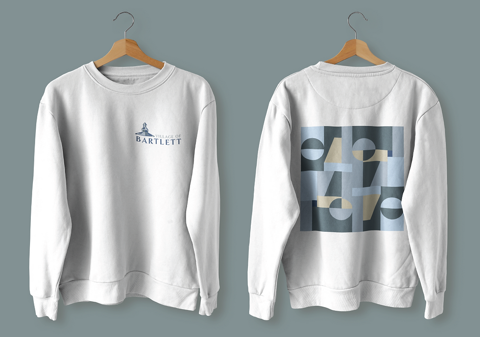
This logo was inspired by the gazebo placed in the heart of the park in the downtown area. The gazebo reflects the small-town, friendly environment and the color palette chosen uses blue as the primary color to resemble serenity and safety.


The Village of Bartlett was a project focused on creating an identity system for this town. Throughout this project, a logo was created that took into consideration the town, its people, and its values.
The goal of this project was to create a new logo for the Village of Bartlett that resembles the values of the town and the identity behind it. This was executed by encompassing the values behind safety and the friendly environment they stand behind through the use of color and the soft design of the logo.